Since the condo is officially on the rental market and after all the talk the last few weeks of all the work that we’ve been doing to the condo I thought it was about time to show you some before and afters. Since I’m new to this blog thing and didn’t get before shots (in my defense most of the work started pre-blog) I tracked down the original MLS photos from when Ken bought the condo back in late 2009.
Some rooms are more drastically changed than others, personally I think it looks much more updated in person than the pictures convey… but maybe I’m biased.
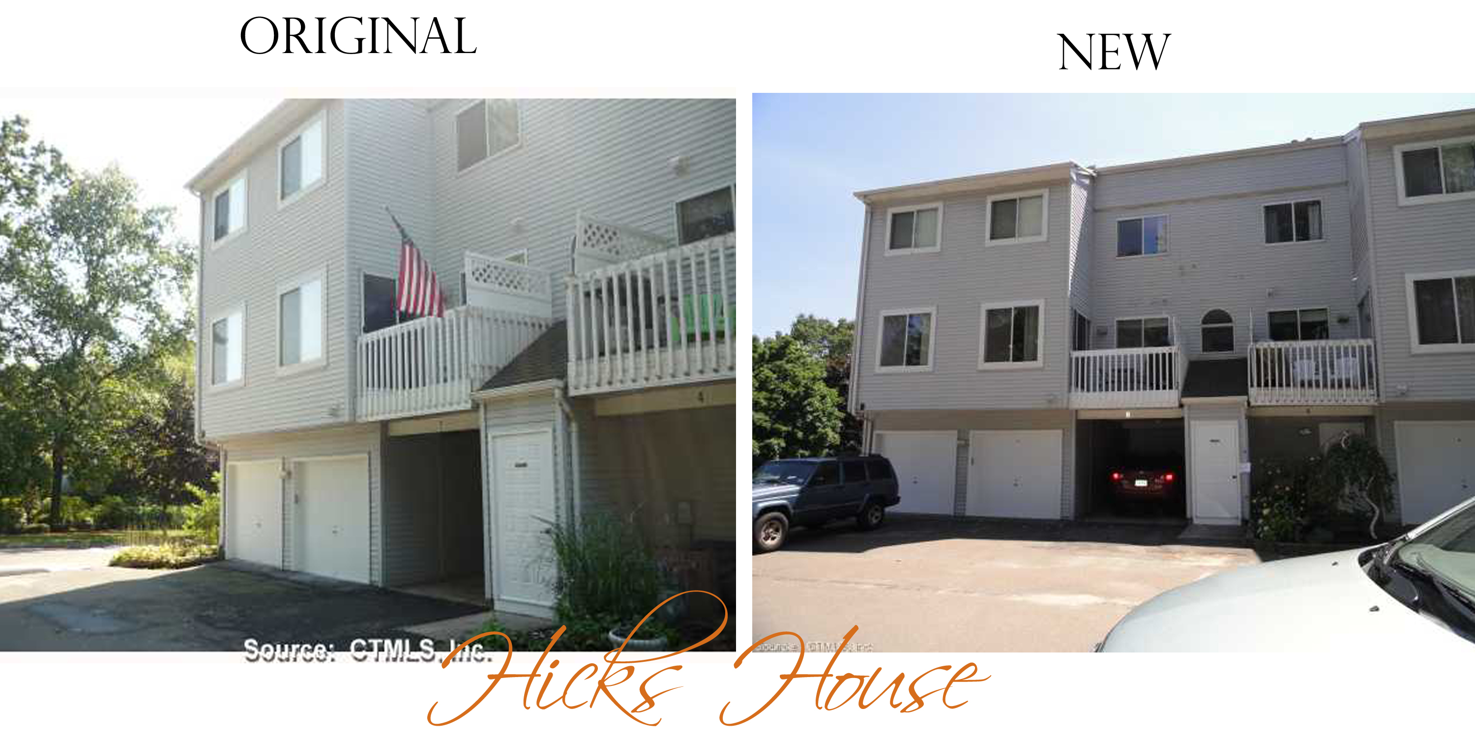
I actually like the original exterior shot better…
So maybe not the best photo to start with since the previous agent took a better exterior shot… but it’s a condo there is only so much we can do to the outside… Moving the agents car before taking the photo so it’s not in the lower corner should have been one of the things done.

I’m not sure you can tell in this picture but there used to be nasty wallpaper
In addition to removing the wallpaper and painting the walls, the weird wood window valance was also removed (Ken literally just grabbed on and pulled it off), as was that old corner TV. We stopped short of de-almondizing the kitchen. We completely realize this badly needs to be done. But we’re renting and that’s a huge expense… so almond EVERYTHING is.
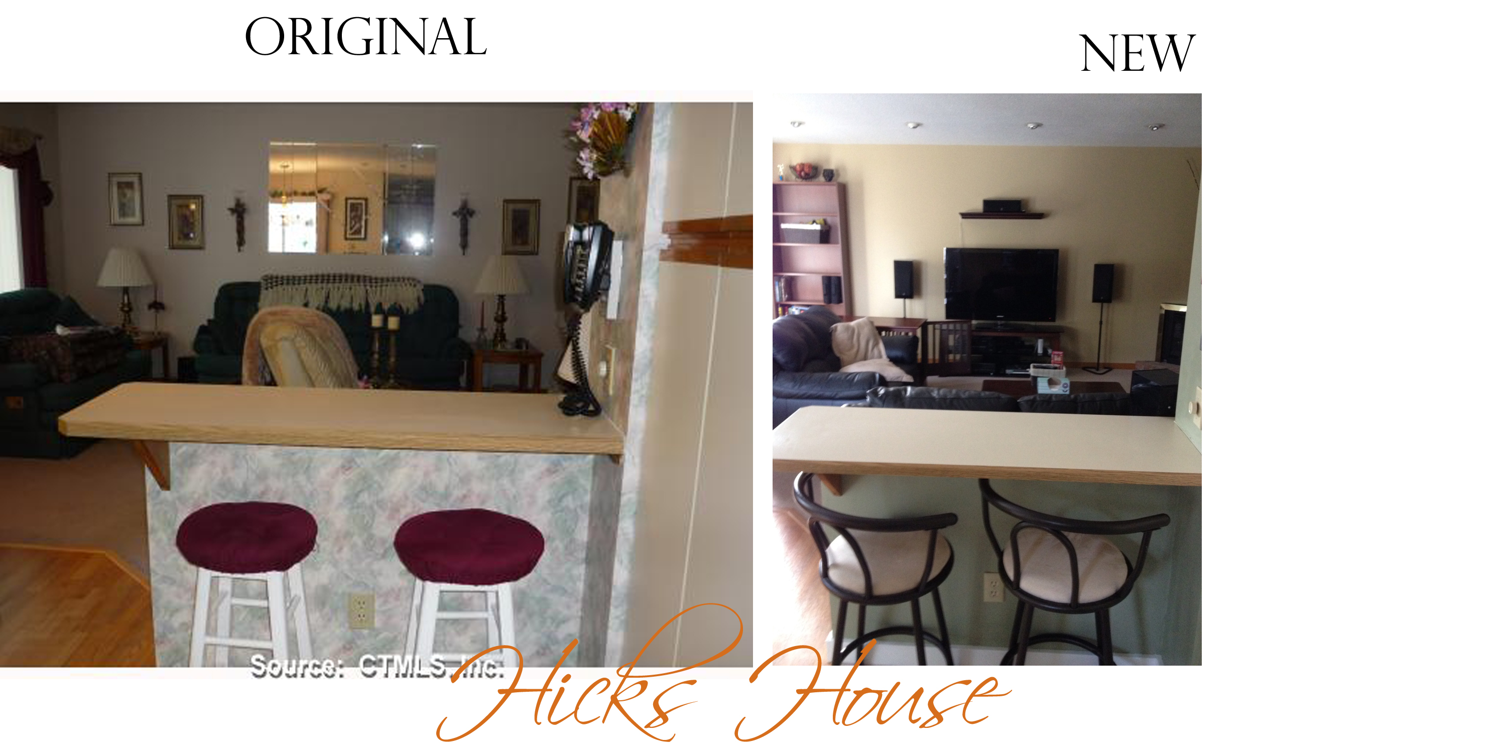
Another room from the kitchen facing the living room
It’s easier to see the nasty 80’s fabulous wallpaper that used to be in there from this angle. Also, is that a corded phone?! We don’t even own one of those.
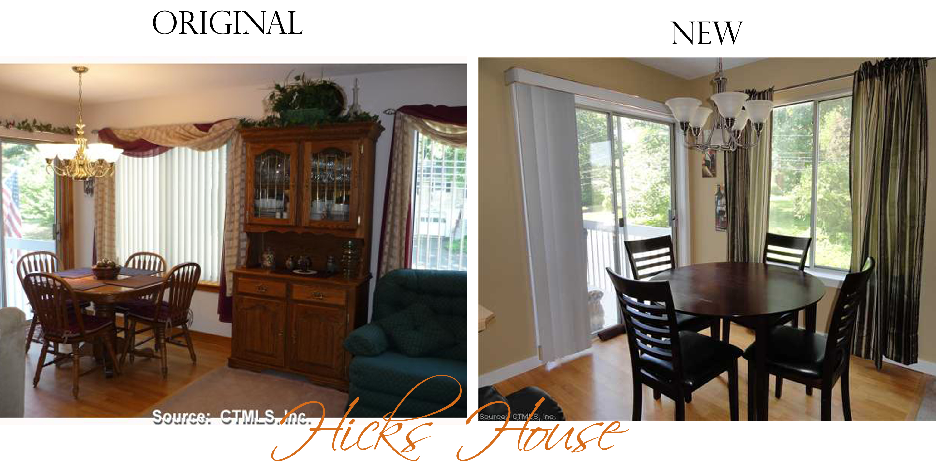
Right off the kitchen is the dining room which got a fresh coat of paint, more modern curtains, white trim and a brushed nickel chandelier in place of that old brass one. (extra points if you can spot Chloe’s photo bomb)

living room
This room’s biggest problem was the furniture layout, it didn’t make any sense, we also removed those wall mirrors, replaced the carpet painted the walls, and the trim (that wood piece didn’t get done before the photo shoot… the TV was too heavy)
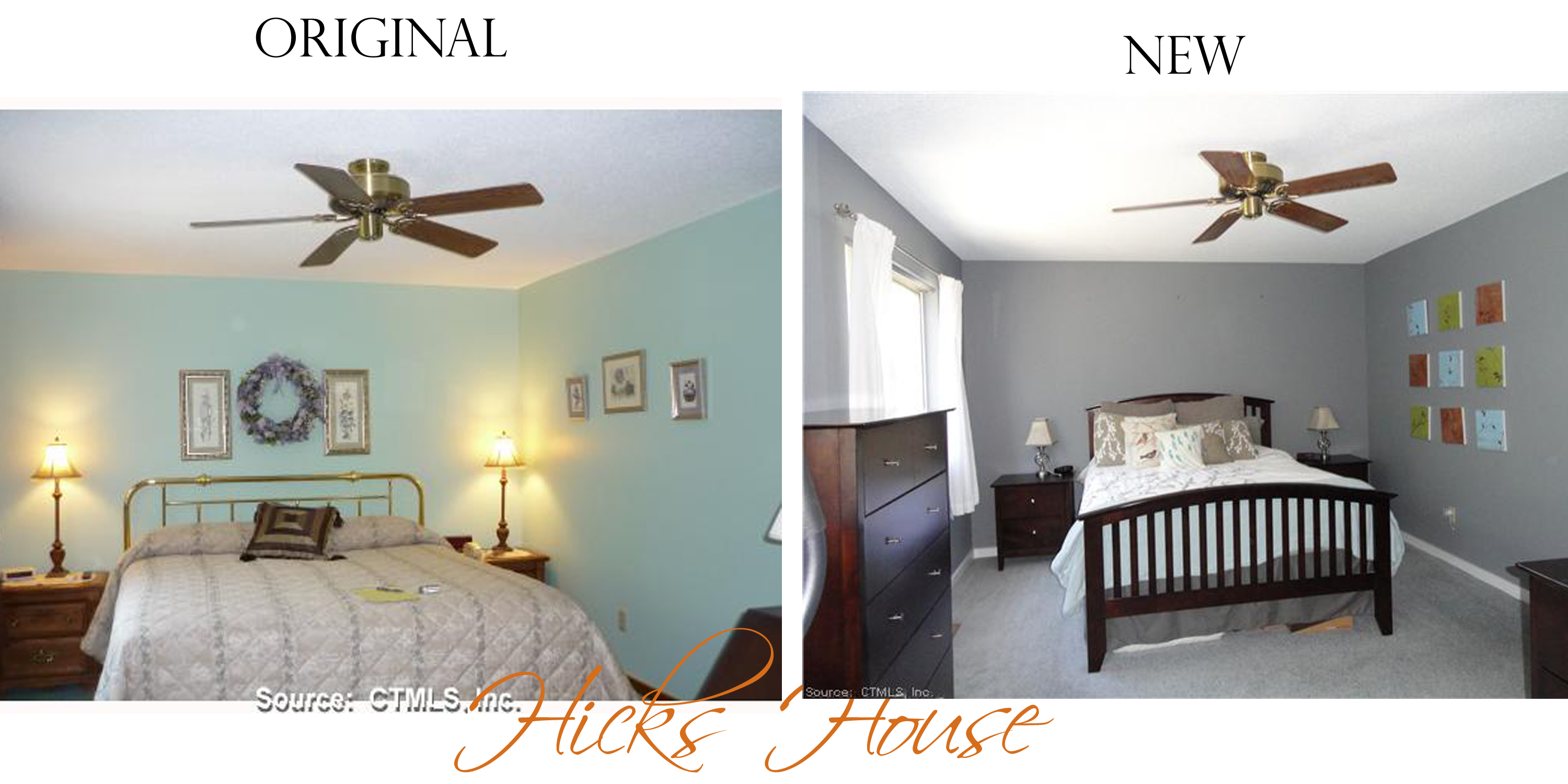
In addition to saying adios to the toothpaste green color in favor of a dark cool grey, we also painted the trim white and replaced the carpeting.

second bedroom
One of the bigger projects, in addition to patching all the walls (we mainly used this as a gym and some weights may have collided with the wall), painting the walls a more neutral color, and painting all the trim; Ken also made this awesome built in desk in one of the two closets.
upstairs bathroom
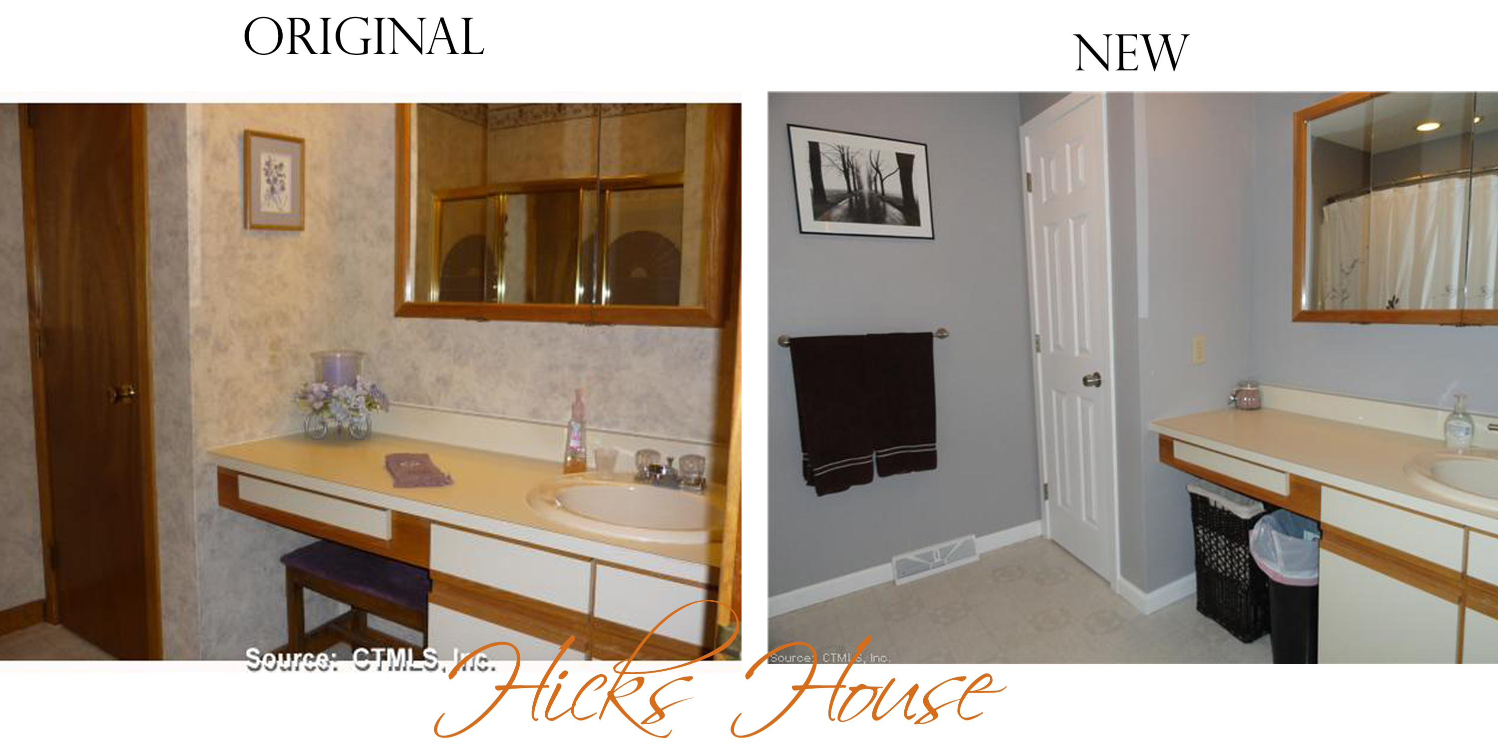
Another de-wallpapering project. The previous owner LOVED their wallpaper! This room got a coat of a cool light gray, white trim new doors and just to the left of this shot used to be a brass shower sliding door. (Eww it even had frosted glass) That was removed in favor of a bowed out shower curtain rod and modern white, and gray curtain. I unfortunately didn’t get a picture of the new shower but I have an old one just to give you nightmares…

AHHHHHH!!!!
Here’s some bonus photos I don’t have before’s of:

upstairs hall. Hello pretty white trim!

downstairs hall, the white trim and new doors look fabulous if you ask me
another de-wallpapering project
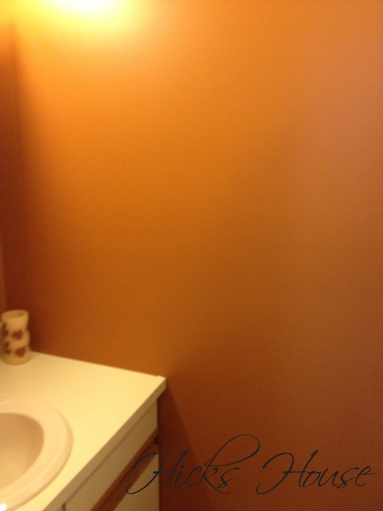
I have mixed feelings about the half bath. Granted this is a terrible photo. We picked this paint color out two years ago and just got around to putting it up. Now neither of us like it… it may be safe to say we hate it (which is odd because as you know orange is my favorite color). I’m pretty sure if it went up when we first bought it I may have liked it. Hopefully whoever rents it likes it better than we do.
So what do you think? Two months of hard work, better before or after?