Hicks House

From Builder Basic to Beautiful


15 Comments

A Splash of Color

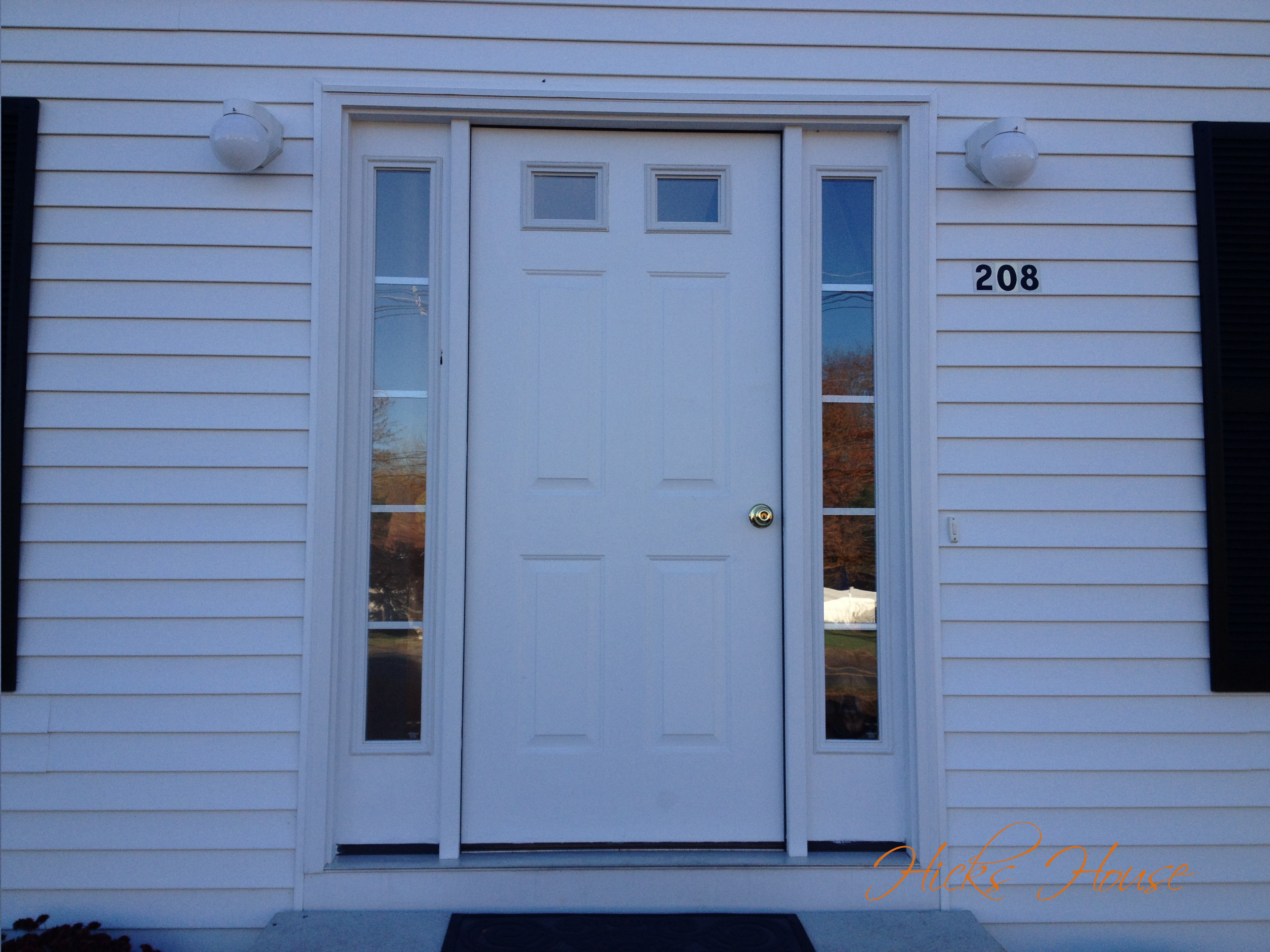
What color to paint the front door?  It’s such a big decision it sends the first impression that visitors and passerby’s see of your home.  It was such a big decision in fact that when the builder offered to paint the door for us before we closed we couldn’t come to a decision.  I even went so far as to PhotoShop different colors onto a picture of the house to help us decide.  In the end we decided to live with the house for a while and just had him paint it white.

white house with a white door - how ordinarily boring

white house with a white door – how ordinarily boring

close up

close up

After several months we finally came to the consensus that we wanted yellow. It’s such a happy color, how can you come home to a yellow door and not become instantly more upbeat? Now the only question was what kind of yellow?

This was our inspiration that I found our Pinterest.  We both loved it.  It’s from Beautiful MattersBlog

Inspiration Door

Inspiration Door

So we went to the paint store and looked at all the options of paint swatches and came to a decision.  I was slightly worried it may be on the bright side, but hey it’s only paint and the whole point is to get the door to “POP” right?

So I got to work cleaning the door with some mineral oil to get off any dirt and grime that was on it. (I read this is extremely important in order for the paint to adhere properly.) It turned out to be a LOT dirtier than I could have imagined.
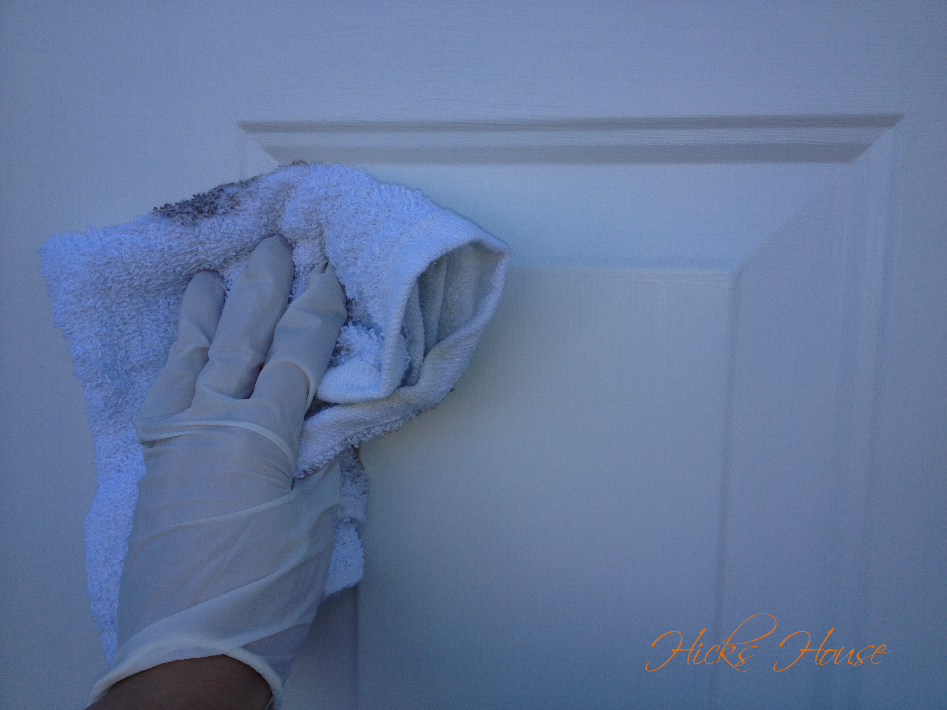
look how dirty!

look how dirty!

Then I got ready to start painting – shook up the can to mix the paint properly and popped it open…

the first sign this might not go so well...

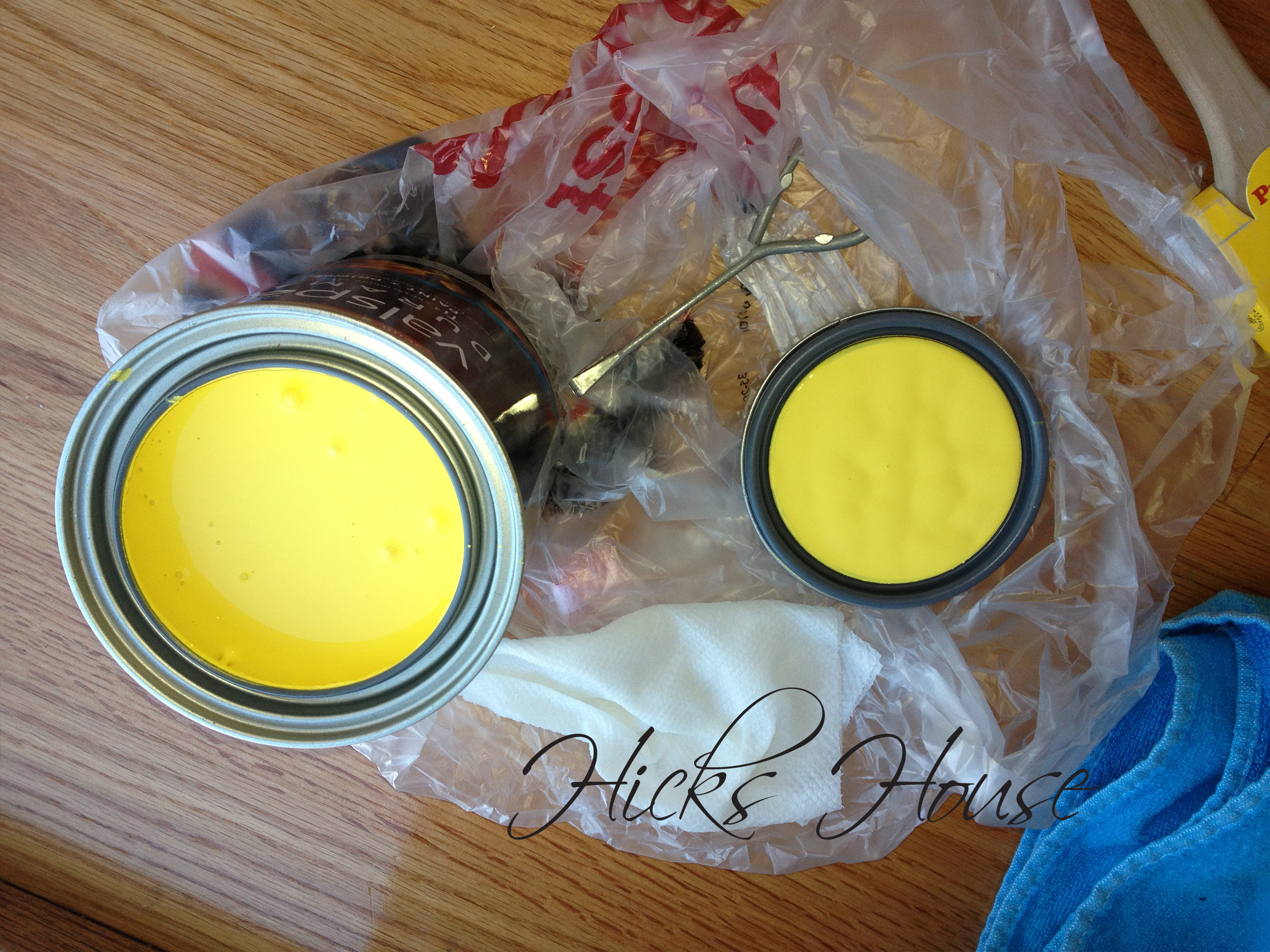
the first sign this might not go so well…

It looked awfully bright, but hey the inspo door is bright and you can’t always tell by what the color looks like in the can right? After all there is way more of it concentrated in a small little area and it always looks different once its dry. So I got to painting. Here’s the finished product:

close up

close up

far away

far away

My eyes! MY EYES!!! We couldn’t have possibly picked a color this bright! the swatch must have lied to us…

oh but we did pick it

oh but we did pick it

What were we thinking? I’ll tell you what I’m thinking now, I’m thinking I need a re-do. As its now the end of October and its getting too cold outside in New England I may have to wait until spring. It’s possibly it may grow on me in the next couple of months – stranger things have happened.

The bright yellow on bright white is just too much – the inspiration door is bright yellow on gray which helps tone it down… Rookie mistake!  We should have known better!

So what do you think is it too bright or just right? I’d love to hear your opinion!


3 Comments

Condo Before and After Shots

Since the condo is officially on the rental market and after all the talk the last few weeks of all the work that we’ve been doing to the condo I thought it was about time to show you some before and afters.  Since I’m new to this blog thing and didn’t get before shots (in my defense most of the work started pre-blog) I tracked down the original MLS photos from when Ken bought the condo back in late 2009.

Some rooms are more drastically changed than others, personally I think it looks much more updated in person than the pictures convey… but maybe I’m biased.

I actually like the original exterior shot better...

I actually like the original exterior shot better…

So maybe not the best photo to start with since the previous agent took a better exterior shot… but it’s a condo there is only so much we can do to the outside… Moving the agents car before taking the photo so it’s not in the lower corner should have been one of the things done.

I'm not sure you can tell in this picture but there used to be nasty wallpaper

I’m not sure you can tell in this picture but there used to be nasty wallpaper

In addition to removing the wallpaper and painting the walls, the weird wood window valance was also removed (Ken literally just grabbed on and pulled it off), as was that old corner TV. We stopped short of de-almondizing the kitchen.  We completely realize this badly needs to be done.  But we’re renting and that’s a huge expense… so almond EVERYTHING is.

Another room from the kitchen facing the living room

Another room from the kitchen facing the living room

It’s easier to see the nasty 80’s fabulous wallpaper that used to be in there from this angle.  Also, is that a corded phone?!  We don’t even own one of those.

dining room

Right off the kitchen is the dining room which got a fresh coat of paint, more modern curtains, white trim and a brushed nickel chandelier in place of that old brass one.  (extra points if you can spot Chloe’s photo bomb)

living room

living room

This room’s biggest problem was the furniture layout, it didn’t make any sense, we also removed those wall mirrors, replaced the carpet painted the walls, and the trim (that wood piece didn’t get done before the photo shoot… the TV was too heavy)

master bedroom

In addition to saying adios to the toothpaste green color in favor of a dark cool grey, we also painted the trim white and replaced the carpeting.

second bedroom

second bedroom

One of the bigger projects, in addition to patching all the walls (we mainly used this as a gym and some weights may have collided with the wall), painting the walls a more neutral color, and painting all the trim; Ken also made this awesome built in desk in one of the two closets.

upstairs bathroom

upstairs bathroom

Another de-wallpapering project.  The previous owner LOVED their wallpaper! This room got a coat of a cool light gray, white trim new doors and just to the left of this shot used to be a brass shower sliding door.  (Eww it even had frosted glass)  That was removed in favor of a bowed out shower curtain rod and modern white, and gray curtain.  I unfortunately didn’t get a picture of the new shower but I have an old one just to give you nightmares…

AHHHHHH!!!!

AHHHHHH!!!!

Here’s some bonus photos I don’t have before’s of:

upstairs hall.  Hello pretty white trim!

upstairs hall. Hello pretty white trim!

downstairs hall, the white trim and new doors look fabulous if you ask me

downstairs hall, the white trim and new doors look fabulous if you ask me

another de-wallpapering project

another de-wallpapering project

I have mixed feelings about the half bath. Granted this is a terrible photo.  We picked this paint color out two years ago and just got around to putting it up.  Now neither of us like it… it may be safe to say we hate it (which is odd because as you know orange is my favorite color).  I’m pretty sure if it went up when we first bought it I may have liked it.  Hopefully whoever rents it likes it better than we do.

So what do you think?  Two months of hard work, better before or after?