Hicks House

From Builder Basic to Beautiful


4 Comments

Awash in Color

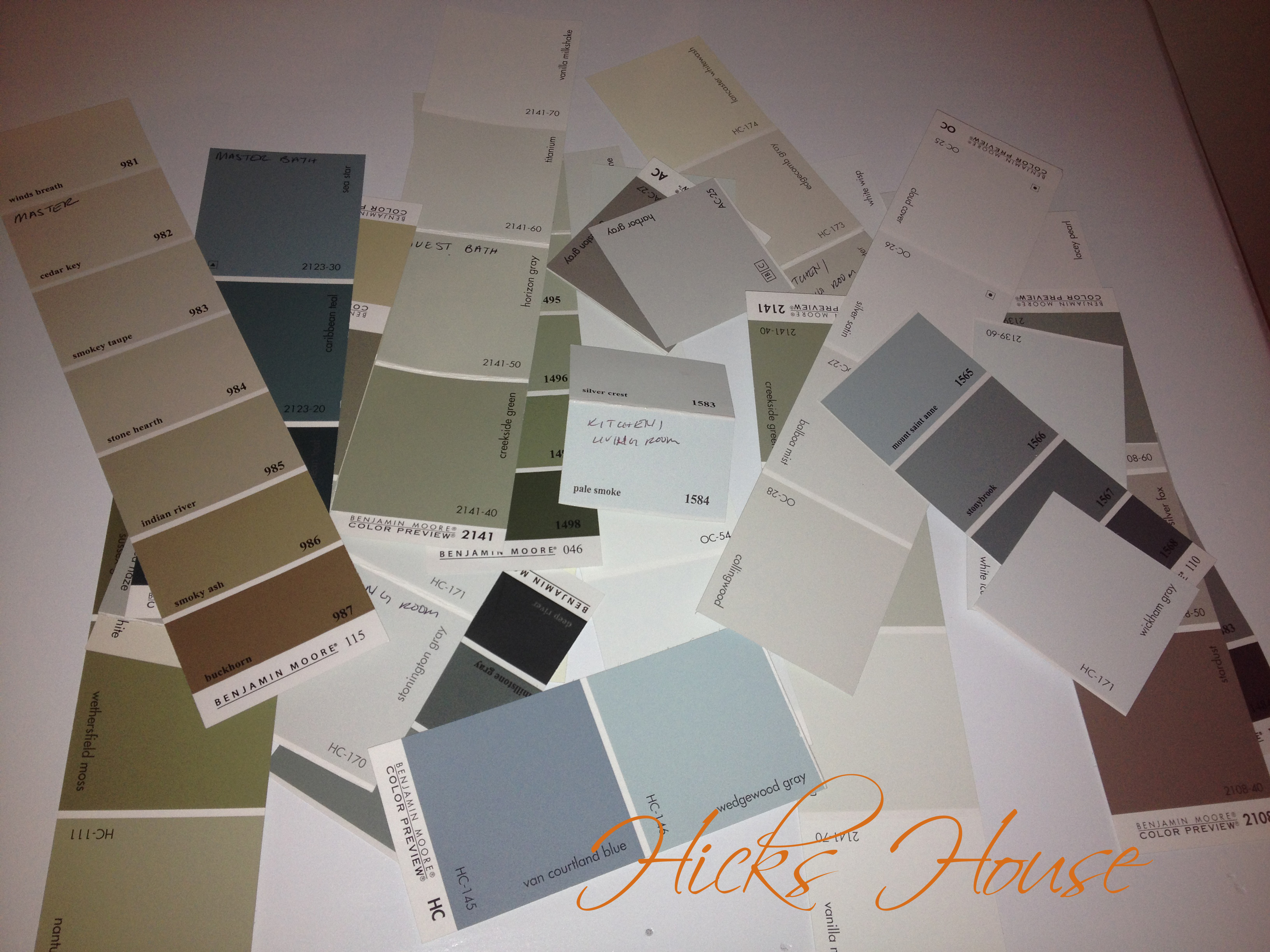
If you’ve been keeping up and read my last post you know that we bought all new paint colors for the house. While picking out the colors and bringing them home hand me jumping up and down like an excited school girl ready to jump right in and start painting – my more practical counterpart ensured we did the proper prep.

We collected all of the painting supplies we had leftover from when we painted the condo (see here, here, and here) and laid them out on the dining room table to see what we had and what we needed.  Then Ken went around the room with a flash flight (the lighting in there is currently a single bulb in the center of the room – thus very very bad) to find any imperfections (paint drips, globs, popped nails) in the wall so that we could mark them to be sanded down.

Inspector at work

Inspector at work

Then we covered the dining room table in a tarp which I think made it look like a Dexter Kill Room

paint prep dining room 1

paint prep dining room 2

Perhaps it is.. Afterall this is the Room the Builder Grade White Paint Came to Die dun dun dun… Thanks to the Master Hide (seriously that is the name of it) paint the builder used there were actually quite a lot of imperfections; some we had noticed previously, some we had not. They were all sanded down and the ones that needed it were compounded then sanded down again.

Thankfully the builder was nice enough too lazy to move the paint out and we used it to go over the sanded spots bringing it back to a nice smooth even colored surface. Had we been priming this step might have been unnecessary however we are using the builder white paint as a primer level and didn’t want any discolored spots showing through.

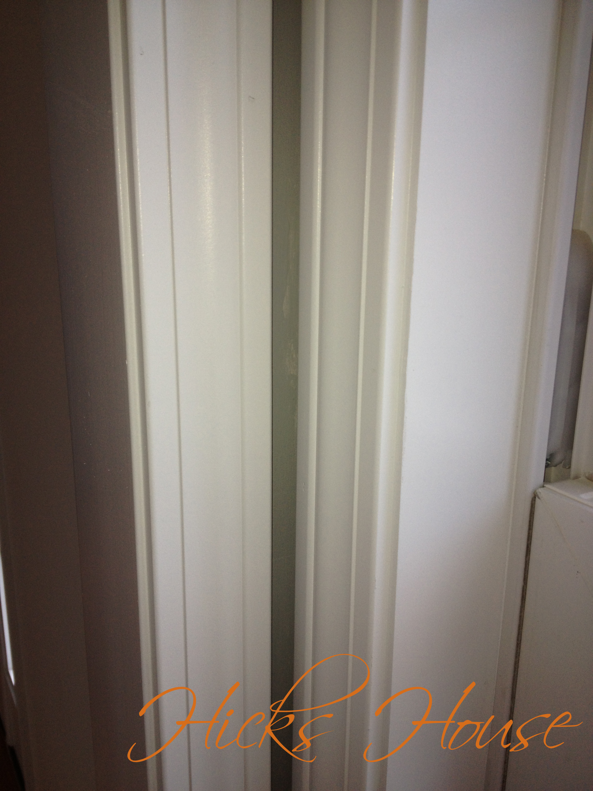
After the “primer” dried I worked my way around the room with a ladder cutting our chosen color (Coventry Gray by Benjamin Moore) in while Ken taped off around the doors and windows. Including this nice teeny tiny area between the window and the door. Seriously what were they thinking when they put these things so close together?

tiny space between door and window

tiny space between door and window

Not only does it complicate the painting (I had to use a tiny craft brush) but it creates a conundrum on how exactly we are going to hang a curtain rod here. We have some ideas but are definitely open to suggestions as well 🙂

Once the taping was done and I was about 3/4 through the room with the cutting in process Ken rolled the walls. This is a decent sized room and we really wanted to try to get it done in one coat and with one gallon. (paint for an entire house is expensive) Lucky for us we had decided to go entirely with Benjamin Moore paints for our house – a brand we had never used before – and learned you definitely do get what you pay for with paint. The Benjamin Moore paint covered much thicker, didn’t come off the wall if you rolled over a still wet painted area and had a much more even coating we couldn’t see the roller or brush marks after the one coat which is something that always bothered us with the “bargain paint” when painting the condo.

We made it by the skin of our teeth, there was merely a drop left in the bucket once the first coat was done. I wasn’t able to get very good pictures due to the crappy lighting single bulb and the fact that the kill room will be set up until all the rooms are complete; but you can get the general idea for now.

dining room

dining room

that pesky spot

that pesky spot (still wet thats why the shiny spot)

So there we go, 1 room down 9 more and the hallways to go!


27 Comments

New Year – New Paint

Bye Bye 2013 Welcome 2014

Bye Bye 2013 Welcome 2014

2014 is finally here. I don’t know about you but for me it came up faster than any past year I can remember (although I think I say that every year).

Hopefully you all had a wonderful holiday season and New Years with family and friends. We were lucky in that we were both “on vacation” from Christmas Eve through New Years Day so we were able to get some work done around the house as well as some relaxing and visiting with family and friends.

The major home accomplishment was that we picked out and bought paint for the ENTIRE house. If you’ve read this blog before you may know and that we haven’t had the best luck picking paint colors in the past… the condo guest room, half bath and house front door were all pretty big disasters. We’re taking them as learning experience.

We choose to believe that after three BAD choices now we know what we’re doing (we hope) and due to time and money we decided not to do any test paint swatches (GASP). I know, I know it’s against all decorating advice you’ve ever heard. How can we be so sure that we won’t massively screw up again? Well we can’t, but we’ve learned a few things:

  • Paint colors always look brighter on the wall than they do on the paint swatch ALWAYS
  • We don’t like bright colors on our walls (a problem since the “muted” colors we’d picked in the past all ended up being super bright)
  • We need to pick colors that are much lighter than we think we want to get the color we actually want

.
We went to the paint store with a list of swatches we wanted to pick up based on other blogs I’d read about great paint colors, searching on the Benjamin Moore website, and of course the holy grail of anything home decorating – Pinterest. Then we picked up additional colors that spoke to us in the store and brought it all home.

There were a LOT of colors. It seemed completely overwhelming however once we got started the process of elimination was actually a lot easier than we had thought. There were even several cases where looking at a color on the “list” for a particular room we both said not for this room but definitely for this room. Having a couple of items in each room that were staying helped too.

For the large kitchen/living room area we held up the swatches to the cabinets, countertops, couch, painting and curtains (that we bought but will wait to hang until after we’re done painting – so be patient). Interestingly the color I thought I wanted Revere Pewter – in fact I hadn’t even picked a back up color didn’t work. It looked great in the kitchen area but was too close to the color of the and the aforementioned curtains. The pretty “greige” of Revere Pewter was just much to beige next to them. We ended up going with a color that Ken grabbed on our way out the door that helps pull in all the turquoise accents while still giving that cool neutral feel.

To see just how many colors we went through in our mad dash through the house here are the rejects:

pile of rejects

pile of rejects

And here are our choices. I will go into more detail as I post the finished painted rooms one by one. As I said ignore the writing on some of the swatches. We wrote room names on them in the paint store and as stated earlier some rooms got switched… you’ll also notice a lot have no room name written on it showing how many we picked out of the random pile off of our original list. I think we only went with 2 or 3 original picks and not all of them are in the originally intended room.

Hicks House Color Scheme

Hicks House Color Scheme

They all look very similar in this photo, and even when looking at them in person. However from we’ve learned in the past once its on a big expanse of wall the differences – the now subtle undertones of green and blue – will be greatly magnified while still having a nice cohesive look and feel. We’re confident that this time our picks will be more what we’re looking for, and from the painting we got done over vacation that appears to be the case so far.

So what do you think, do you like our cool neutrals?